Vibrant, Fresh and Modern – Meet the Newly Branded Zest
Le récap de l’article
Since the beginning, Zest has changed dramatically, but our visual identity has stayed the same. Discover the journey behind the rebranding of Zest and its reflection onto our new website and solution interface.
Over three short years, Zest has entered, influenced and triumphed in the employee engagement market. We’re a forward-thinking, progressive company with a mission to deliver our customers an innovative, integrated solution to team engagement. Since the beginning, we’ve seen huge growth and evolution, but our visual identity has stayed the same.
Internal talent for the win
Here at Zest, we practise what we preach. With our strong focus on career development and skill acquisition, we turned to the best people to do the job of rebranding Zest: our internal design team. Usually geared towards creativity on the product front, our team of design experts led the charge in the initial rebranding stages. With unrivalled knowledge of our solution, our customers and our mission, they were the top choice for the challenge.One pre-requisite: evolution
Since day 1 of this project, we had one pre-requisite: the rebrand had to be an evolution of Zest’s previous identity. We have a strong customer base and dominant position in the market, therefore the success of Zest 2.0 needed to be built upon these inherent strengths. That meant keeping the name (we’ll always be Zest!), similar colors (a vibrant green paired with a deep dark hue), and our renowned smile built into the logo. The team began devising a design strategy that would stay true to the core meaning of Zest.Say cheese
Zest’s first logo was created when the company launched in 2015. From the beginning, the identity was designed to be playful and fun. This is primarily illustrated through the smile in the logo, reflecting happiness at work and the promise of fulfilled employees.Historic Zest logo and Isotype.
Setting the fundamentals
It was important that the new logo was a clear evolution of the previous, hence we would stay within some boundaries: the smile under the ‘e’, the dark text and green smile accent, the curve of the ‘t’…![]()

Zest’s new logo, a clear evolution from the old one.
Decoding the colour palette
To stay on the evolution path, we thought it important to keep green as our primary colour. Associated with vibrancy, freshness and, of course, citrus, green is the perfect reflection of the spirit of Zest. Our original green, whilst more citrussy, was highly tinged with yellow, making it a difficult color to use in large quantities (important for marketing purposes) and not very calming to the eye. By adding a touch blue, we created a dynamic vibrant green which still contained the energy of the original. The same was done for the rest of the palette; the dark purple morphed to a deep, slick navy blue, a great contrast to the green and used in most text instances. The other colors, primarily for use in the solution interface, were chosen to compliment the green and navy. We derived a palette of colors that would blend together in varying instances to allow for multiple applications and thus achieving a secondary palette of striking gradients.The impact of an isotype
Theisotype, which is often used as a standalone identifier, is comprised of a stylised square with rounded corners in the new Zest green colour, and sitting inside it is the smile form, a reflection of the shape making up the bottom of the letter ‘e’.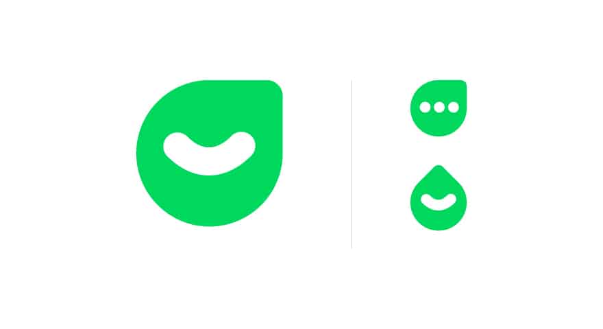
On the left; Zest’s new isotope. On the right, secondary meanings. Top: Conversations bubble, feedback focused. Bottom: Lemon achieved with a 45° counter-clockwise rotation.
A superior website – CosaVostra style!
Once the core brand elements were defined, we needed to roll out the new branding to our most important marketing element: our website. Sharing more than just a lunchroom, we choose to outsource the design of Zest new website to office neighbors and creative design agency, CosaVostra. From Day 1 there was strong alignment between the teams; Zest’s clear vision complimented CosaVostra’s creative approach. This, coupled with the teams’ physical proximity, made it an obvious and smart decision to work together. Experts in UI and UX, CosaVostra designed a state-of-the-art website, targeted towards the B2B SaaS market. The new Zest website showcases a fresh look, with custom-made illustrations, a responsive and easy-to-navigate design, and a strong focus on thought leadership. A dedicated Content Hub is updated regularly with industry news, articles and educational resources.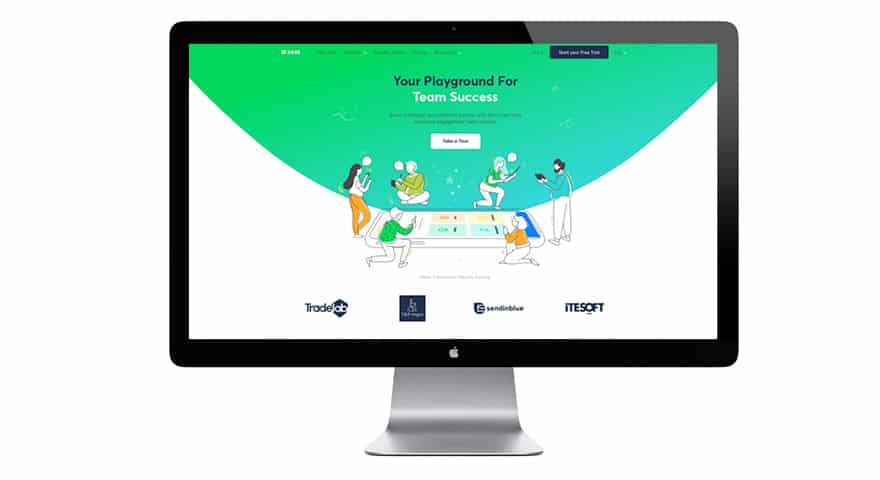
Zest’s newly branding website homepage.
The cherry on the branding cake
Finally, Zest’s new identity is in the process of being reflected into our solution itself. Over the new few months, a roll-out of the new branding, across both web and mobile, will provide users with a complete new interface, improving user experience and creating seamless brand consistency. Stay tuned for updates on our product strategy, centred around an optimised design system.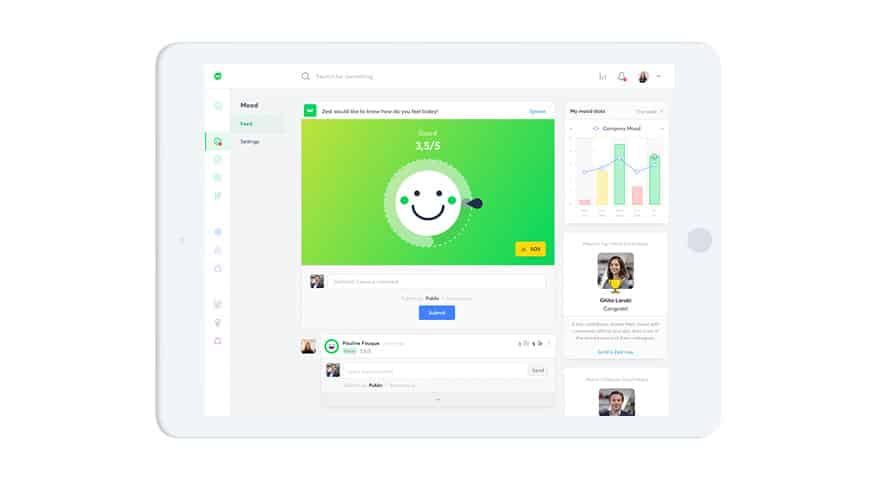
Zest’s new branding reflected into solution interface.
